U of T English Language Program
A visual voice for the University of Toronto School of Continuing Studies was created by foregrounding student experience and success through photo-based storytelling. Beginning with the design of course calendars, this approach was adopted and applied to all marketing and communication touchpoints, more than doubling student enrollments.

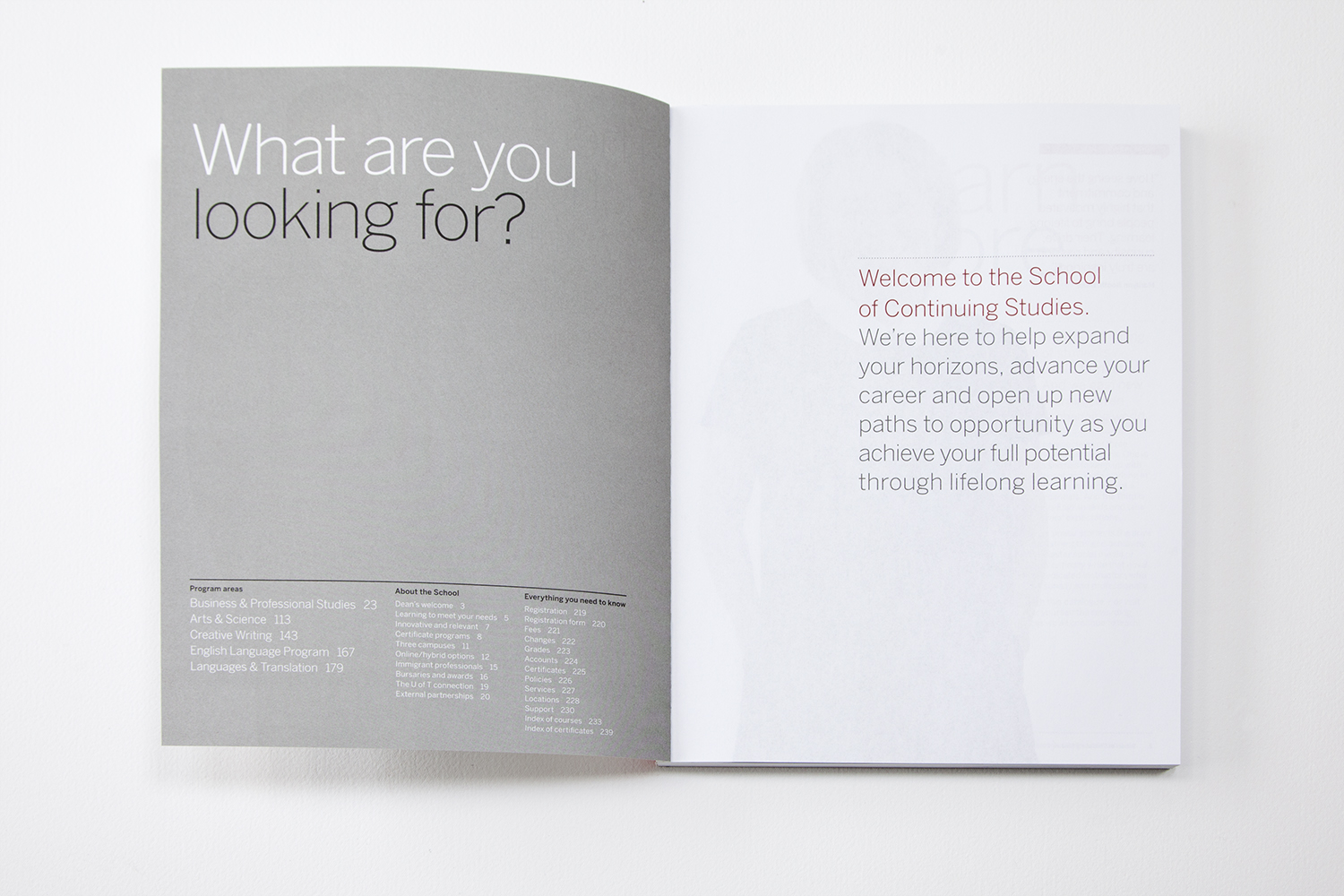
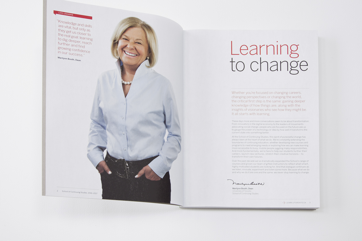
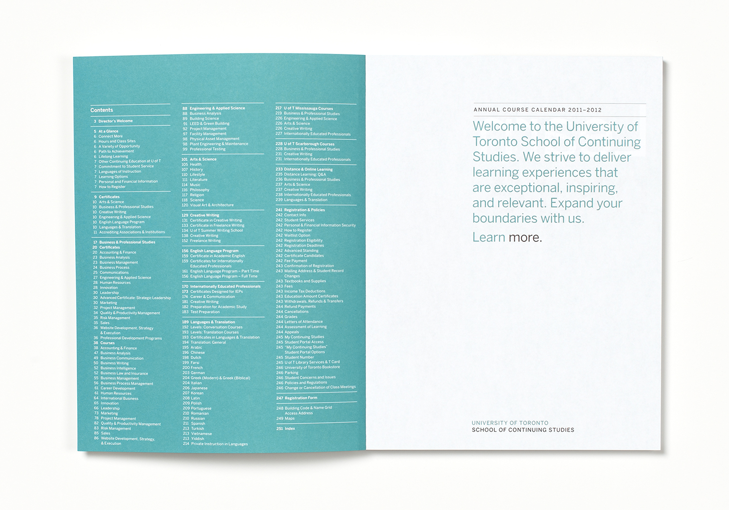
The front of the book is the school's marketing voice, detailing the range and excellence of the offerings.

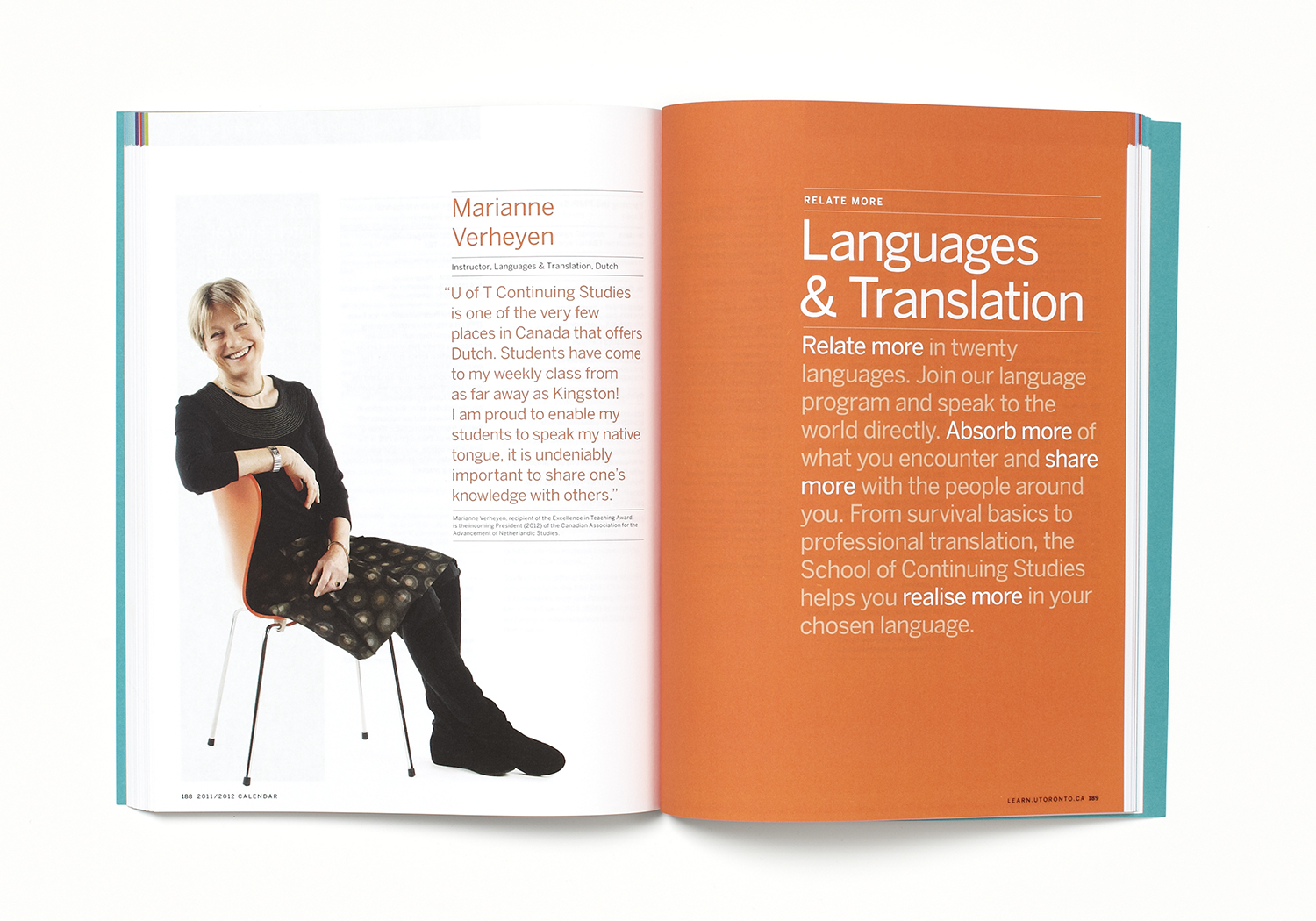
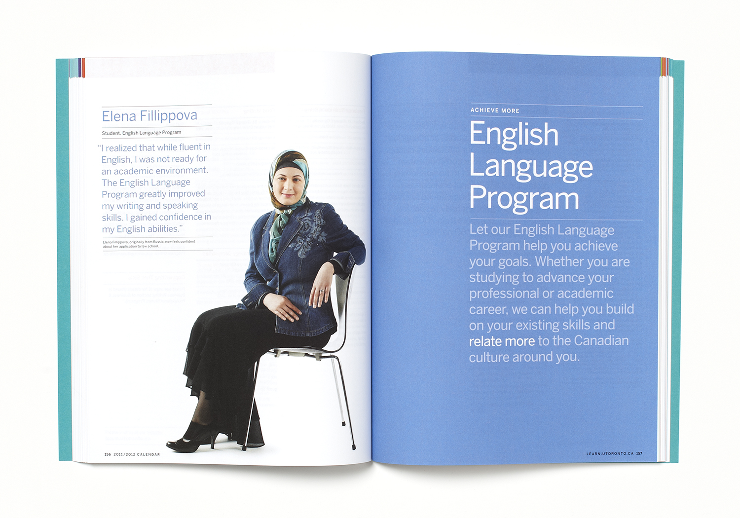
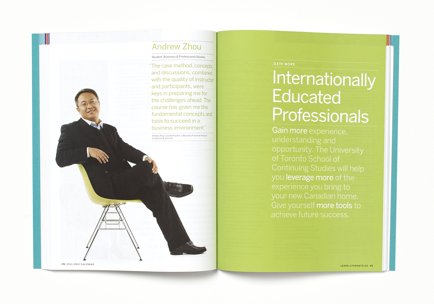
The campaign is based on student testimonials and proof points.

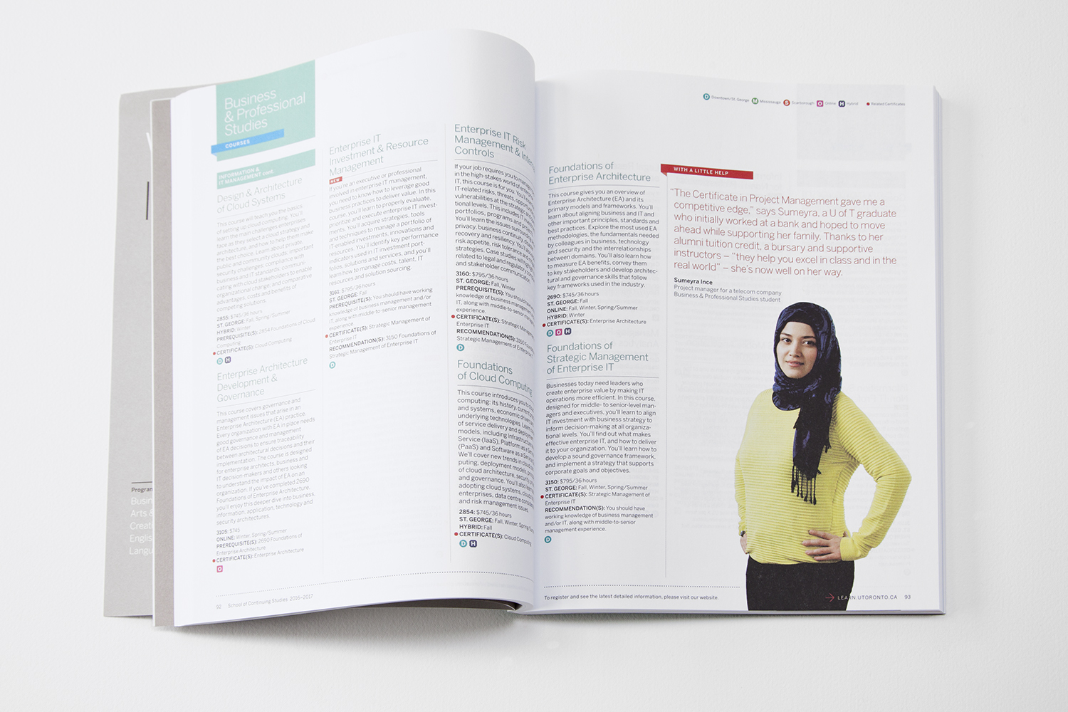
The core design strategy was the development of a clear structure and typographic hierarchy for easy navigation through dense information.
Icons were created to guide students to courses or certificates, and to one of the three campuses closest to them. A legend is at the top right of each spread.

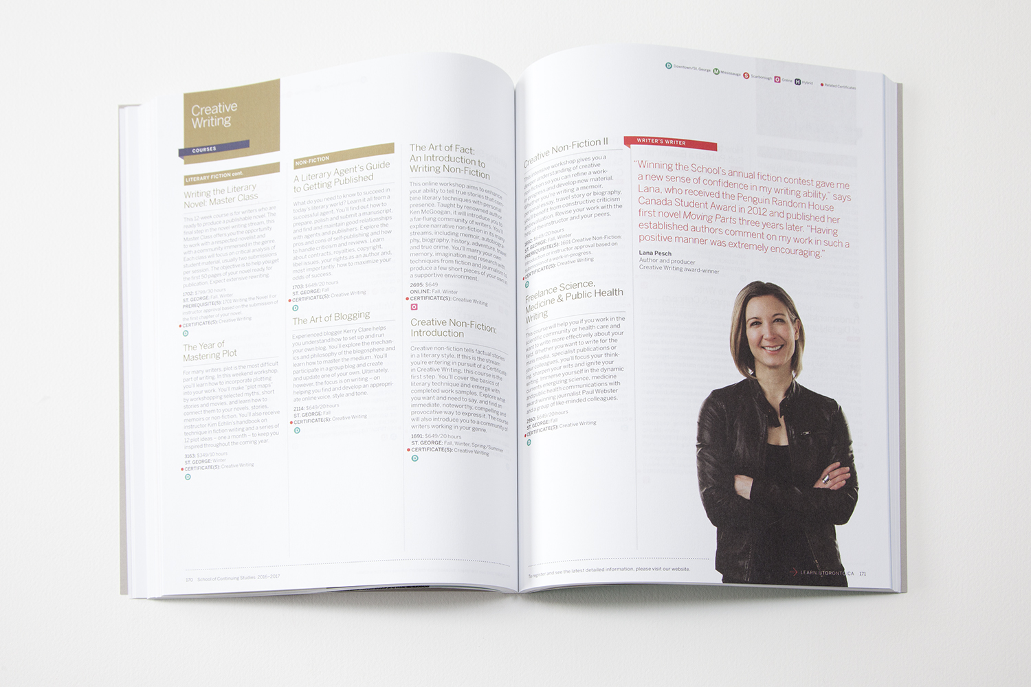
It was always inspiring hearing student's stories at the annual week-long photo shoot. Students loved to participate in the shoots and would leave the studio as forever friends and ambassadors for the school.


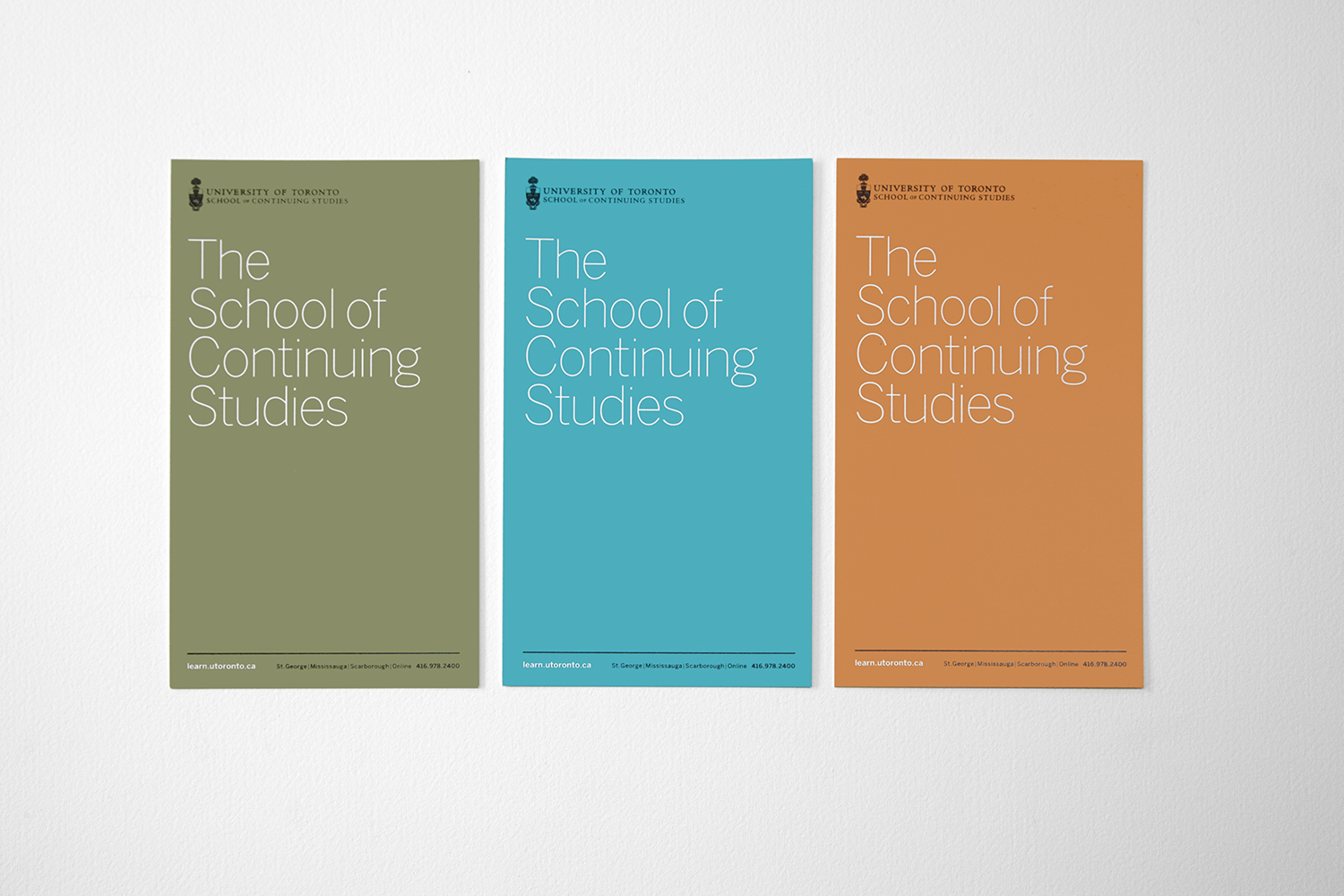

An earlier design iteration.

